
South East IT
This family run IT business required a bold and modern new look in order to stand out and gain a competitive advantage on competitor businesses.
CHALLENGE
A new logo and branded materials were required to create a unique identity for the client that would be adaptable as their business grows.
SOLUTION
Gloss developed a colour palette that was both dominant, eye catching and that would stand out both online and in print. Developing an icon that summarised the brands key offerings - the 'i', 't' and an arrow pointing South East - where the business resides. The result was a simplistic symbol that could be used as a lone standing icon or alongside the company name.

The original logo and the new logo designed by Gloss Design.

Inspiration for the colour palette was found within the products that South East IT work.

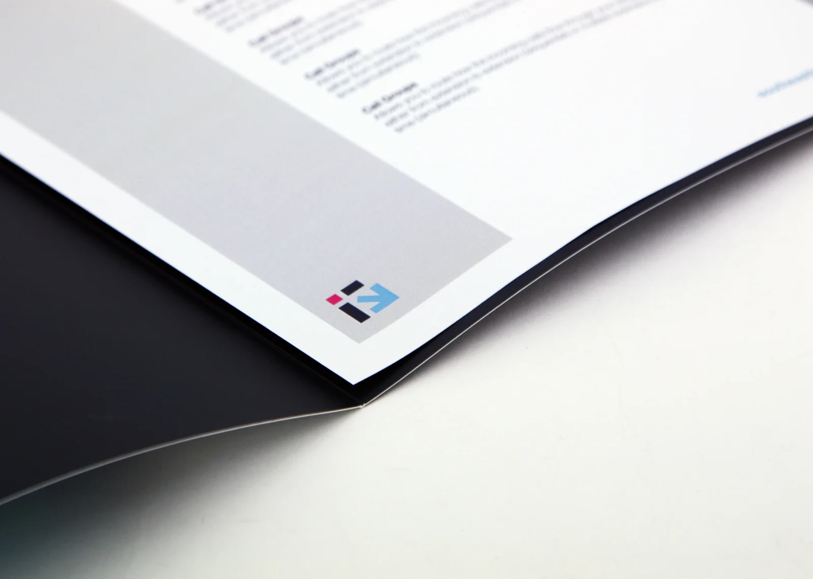
The new icon was incorporated into the design of a Presentation Folder.

Business card designs by Gloss for South East IT.

Template design for proposals.

Gloss Design worked closely with us to help develop our personality through our logo design. They absolutely hit the mark when we asked for elements from our old logo to be reimagined. We are so proud to now showcase our brand through our logo and communication media. We would recommend their services to anyone that is looking for attention to detail, finished artwork excellence and superior printed artwork finishes.
— Sher, MYOB Certified Consultant and Solutions Specialist, South East IT