India Fund
Gloss Design was asked to create a visually compelling brand identity to introduce an IPO to the finance industry and retail finance market. The designs were to showcase the technological advancements within modern India.
CHALLENGE
Gloss Design was asked to produce a logo, stationary and a prospectus to introduce the IPO to the market. A White Paper was also to be designed but was not to be directly associated with the fund. While the prospectus required a corporate design the white paper was to be creative and engaging.
SOLUTION
Taking inspiration from the Indian flag, Gloss developed a visual brand identity that referenced the Ashoka Chakra a modern symbol of progression and growth within India. The brand was then incorporated into a range of print and digital material using two seperate colour palettes to differentiate the formal India Fund brand to the White Paper materials - blue, white and grey and orange, white and grey.

The Indian flag was a source of inspiration for both colours and design.

The final icon was designed to represent progression, growth and technology.

The brand was then incorporated into a variety of stationary designed by Gloss Design.
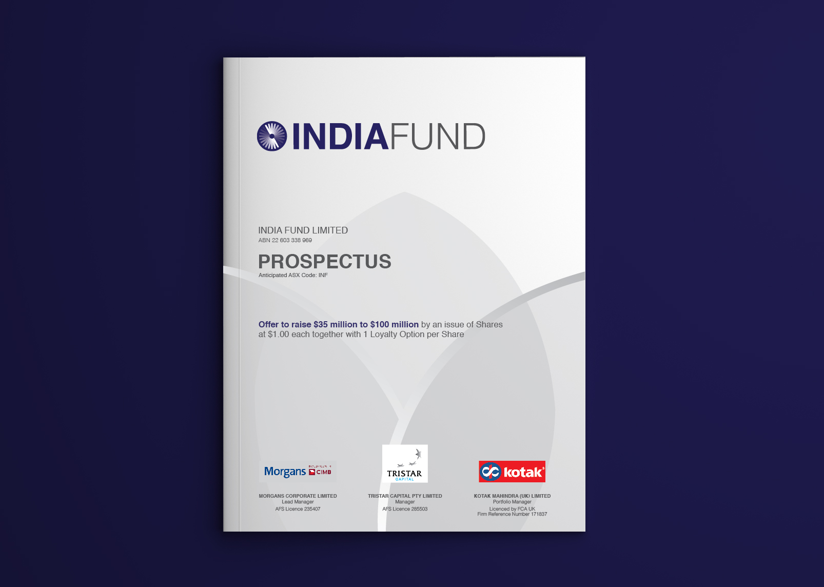
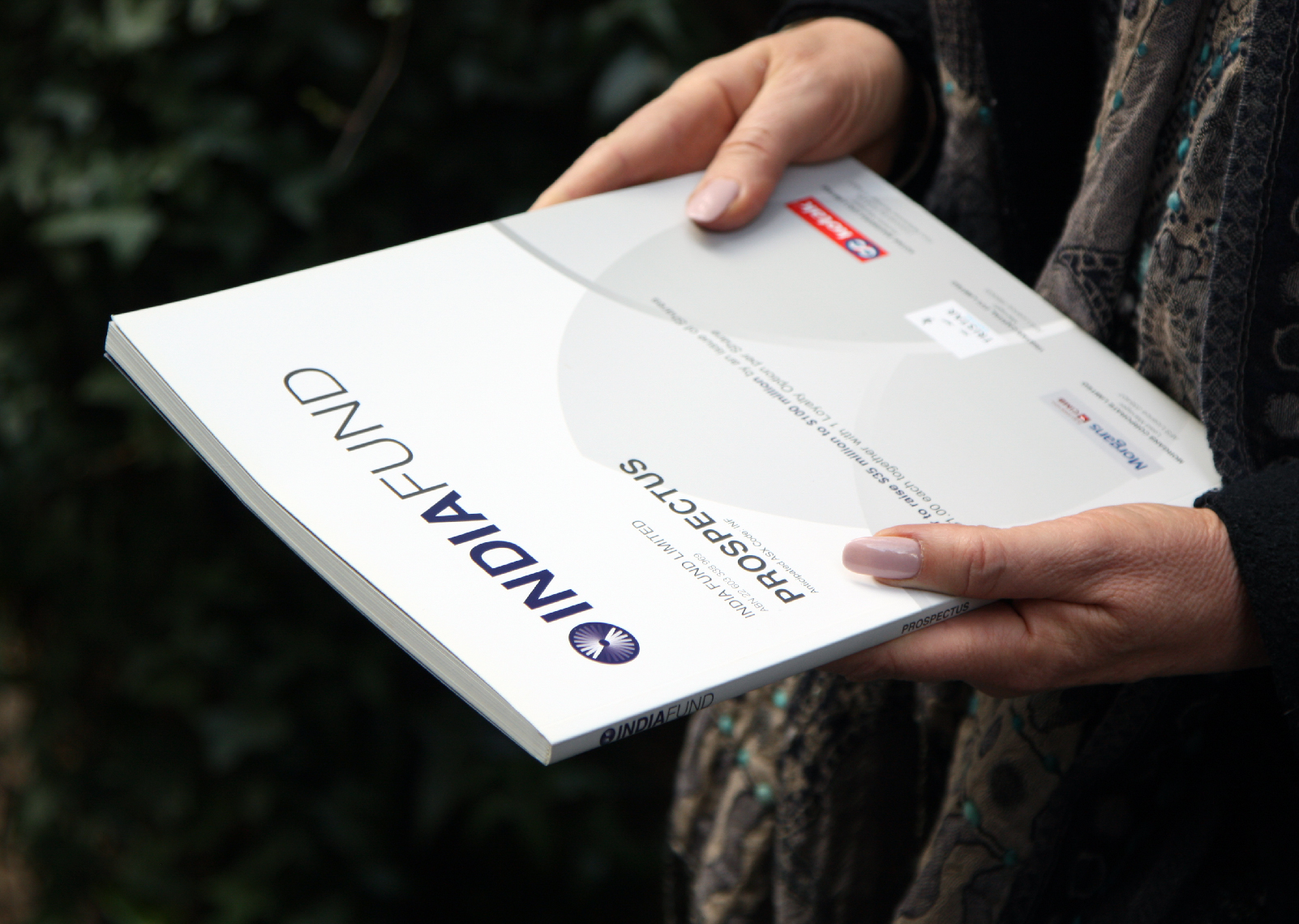
The Prospectus.


Imagery was utilised to act as a divider between the key sections of the Prospectus.

The White Paper.

A 16 page magazine designed to have it's own brand but to accompany the Prospectus.

Infographics were designed to allow information to be taken in at a glance.

Imagery sourced was specifically chosen to highlight a modern India.